Route profitability analysis: the interior design process
July 2000

This is the third in a series of articles on building an effective approach to route and network profitability measurement. The first (February 2000) laid the foundations by setting out the underlying principles for development of this critical source of management information. The second (June 2000) supplied some of the system mechanics (or to follow the building metaphor further, the wiring and plumbing) by discussing methodologies for managing cost and revenue allocations to routes.
This article focuses on the customised "interior design" or rather, the challenges of presenting outputs that are useful, consistent and understood. After all, if management does not know how to interpret what is being presented, all the investment of time and money will again have been in vain.
Now we are at the interface with the users, the challenges become cross–functional. User needs become different even though the base information sources and flows should be the same. Sales will use available information and reports in a very different way than network planners, the finance department or senior management.
For instance, Sales managers may focus on detailed understanding of revenue and yield performance by sales channels and regions — right down to individual agent or agent chains. Network planners may focus on trends in the profit and revenue generating performance of routes and the network.
At the top, senior management must have the right information to enable them to identify issues, to ask the right questions of line managers — to take a "helicopter" view.
The first and foremost thing to avoid? We have seen one set of monthly reports in which senior management were presented with the following for a year–on–year comparison of yield:
- Route Profitability report — up 2%;
- Sales Performance report — up 5%;
- Financial report — down 3%.
It is no surprise that management in this case spent too much of its time debating number reconciliation and not enough time making good decisions. Answer: start again with article one.
Most airline managers in today’s business environment need the following:
- Fast reporting of changes in the market place;
- A focus on profit;
- An ability to dig behind and analyse profit issues;
- Visibility of the impact (forecast) and performance (actual) of decisions; and
- A sound and common basis for decision–making. To accomplish this, many leading edge airlines have a well–developed "Report Strategy" that:
- Defines the key measures for driving management decisions;
- Focuses the airline on common, clear, consistent and visible goals;
- Delivers a suite of standard reports for specific user groups;
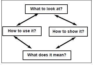
The Report Strategy ultimately addresses for the airline four key questions:
If consensus and clarity is not achieved for any one item, the virtuous circle is broken and the value added of the reports can be called into question.
Hence developing such a Report Strategy will take time. Leading airlines typically quote a period of up to 4–5 years before a stable set of "core" management reports are established and consistently used. At one major European carrier, four senior management level MIS users were taken off–line for three years to create and implement the data flows and reporting architecture.
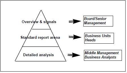
These four questions must be asked and answered at three levels within the organisation.
At level one, senior management must be provided with an overview of the whole network, with mechanisms incorporated to capture and highlight poor or declining performance — an early warning system.
At the more detailed third level, the reports and data architecture must support sophisticated analysis. Here, the frequent user is into designing and parameterising his/her own detailed analyses. Ad–hoc report building and user–friendly interfaces are the rule of the day.
It is in the middle "Standard Report" arena for business unit heads and senior managers that a rigorous process and approach to using information can really add value. Consistency and transparency in decision–making across functions makes for more rapid and accurate action.
There are two prerequisites to success in building the Report Strategy.
First, senior management must set a vision of their priorities and the measures that must drive the airline’s performance. This vision should determine the focus and content of the whole report structure in a cascade effect. From these primary measures, all the necessary supporting reports can be designed for the next level:
- Follow–on "drill–down" reports to give answers or at least further insight on performance changes;
- Business unit reports with their specific activity and performance measures driven by the high–level vision.
What to look at?
Second, the airline must establish a centralised control or guardianship over data definitions. Too often, terms such as gross revenue and net revenue have completely different inclusions/exclusions across and even within departments. The management team must be able to develop a common language and understanding of key measures. The guardian is often the Finance group, with the definitions being agreed by a cross–functional user group. The key measures of performance for airlines will have significant commonality across different types of airlines. All should and will include the basics such as passengers, load factor, revenues, yield and capacity, with trend comparisons across months and year–on–year. Most should and will also have comparisons against plan.
The more contentious issues include:
- Measurement of hub/network effectiveness including connecting revenue impact and spill effects;
- Which profit or contribution levels to be presented; and
- Incorporation and allocation of cargo revenue/ profitability.
There is a large variety of terminology used to describe "connecting revenue". The goal is obvious — to understand the network contribution of each route by measuring the revenue that flows from or onto other routes. After all, there are many where the pure point–to–point traffic would not sustain on–going viability/profitability.
The large US carriers have been focused on network and connecting effectiveness for so long that some literally ignore sales performance as a driver of revenue in the domestic market. The schedule is seen as the revenue generator and very little time is spent worrying about sales: "I'd rather do without a sales force for all the impact they really have" says one senior executive.
The design and selection of levels to be reported should be driven by one simple question: can management take decisions and action based on the information presented? We have seen airlines with the number of reporting levels varying from two to twelve. In the first instance, there was perhaps too little transparency and in the second, most of the levels presented were meaningless in terms of providing "actionable" information.
Analyses will be required at what may usefully be called activity levels:
- Passenger activity: to help understand the true incremental cost of carrying a passenger (e.g. meal, handling, transfer charges, in–flight services, and maybe fuel burn);
- Flight activity: to help assess the profit earned by operating the flight, including the incremental costs incurred (fuel, landing fees, crew allowances etc.);
- Fleet activity: to understand the economics of operating the fleet, by including the incremental fleet costs (aircraft ownership, crew salaries and training etc.);
- Network activity: to identify network profitability by including items such as sales costs; and
- Airline activity: to measure profitability including all overhead costs.
Five levels is probably too many for primary, senior management reports but will be necessary for the real analysts who work daily with the system (e.g., network planners).
The marginal cost of carrying a passenger is nice to know but can be dangerous. The most obvious use is to define what is the absolute minimum price that can be charged for a ticket. While this might be interesting, it is probably undesirable that this value should be released or used by the sales force. Down to four levels!
How to show it?
What does it mean?
At the other end, many purists believe it desirable to allocate all costs, including overheads, down to the route level. The allocation method (block hours, RPKs etc) then raises significant debate because of the danger of bias. The simplest model is to say to overheads = x% of revenue and that the network should make this contribution. Down to three useful, actionable levels! The visual presentation comes down to individual/corporate preferences. Clarity and ease of read are the goals. Graphics are easier to view but there are many who like to see the numbers. Distribution issues may also arise — standardising and controlling via the intranet, for instance. Interpretation is helped by two main elements. First, the common definitions enable a common language and understanding to be developed over time. Second, each primary report should have a short commentary to highlight key factors such as:
- Significant events influencing data;
- Change in data assumptions, inclusions and exclusions from previous reports; and
- Data health warnings.
How to use it?
Here, standardisation of reports by user group is key. If the airline has the right actionable measures, the right cascade into business unit activity, with transparency and consistency in the information, then the use — decision–making — becomes easier and more powerful.